
Mouse
Activities
| Click on element | Click on coordinate | Read checkbox state |
|---|---|---|
| Choose a desktop element to click on it | Click on a specific point in the screen | Get the value from a specific checkbox |
| Set checkbox state | Select list item | |
| Set the state of a specific checkbox | Choose an item from a drop-down list |
Click on element
Description
This activity simulates clicking a specific desktop application element. It is possible to do a left click, right click and double click.
In this article we will also use Notepad text editor as an example.
Desktop Picker
To be able to click an element of an app, we must start from defining the app element to use. This is handled by Desktop Picker.
To pick the desired element, open the dropdown menu in the Interface element parameter and then click the Pick New Element button.
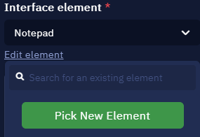
Here you can select an element or pick a new one
This will launch Desktop Picker. Open the desired app, hover your cursor over the required element (for example, text input field in Notepad). It will be highlighted red. Then press Ctrl + X to pick this element.
As soon as the element is picked, this window will appear. It indicates that the element was found and recognized. You can also set the element name here. It will be displayed in Studio Pro.
Advanced options menu displays the structure, or the selector of the indicated element. It usually consists of multiple tabs and each tab has its own attributes and values which represent the hierarchy of how the interface element is developed. You can modify, check or uncheck the attributes to achieve better accuracy or stability of interaction with the element.
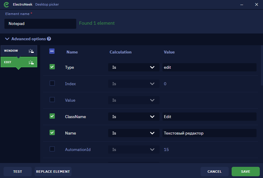
Advanced options menu
The ‘Test’ button lets you check if the element was defined correctly. Upon clicking it, the focus will be shifted to the browser window and the picked element will be highlighted yellow if it was recognized correctly. It can display one of the following messages:
- Found 1 element means that the specific element was successfully recognized.
- Found >1 element means that there are a few similar elements. In this case, it is required to pick one of them or double-check the advanced options.
- Not found means that the element was not recognized and must be redefined or the advanced options must be corrected.
The ‘Replace element’ button lets you pick another element.
Click ‘Save’ once you are ready. This element will be saved for further usage in Studio Pro activities.
Once the setup is done, you should see this in the Interface element parameter. There is a preview image of the picked element.
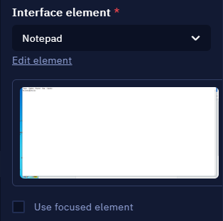
Preview of the selected element
Alternatively, the Use focused element checkbox lets you use the element in your currently opened app. For example, you have opened one more Notepad file and you are currently editing it (this means that your cursor is placed somewhere in its text input field). In this case you may skip choosing the specific element as described above. Your text will be typed into the focused app.
It is also possible to edit an existing element that you have previously picked. To do this, click the ‘Edit element’ button below its name.
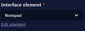
Here you can edit the element or pick a new one
This is what you will see. Here you can change its name or replace the element completely by picking a new one.
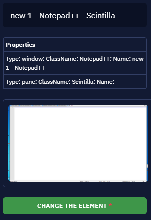
Element properties and the button that lets you replace it
If you choose to replace the element by clicking the ‘Change the element button’, Picker will be activated again. Once you pick the new element, this window will appear. It shows the old and new versions and lets you either save it and overwrite the old element or cancel the replacement.
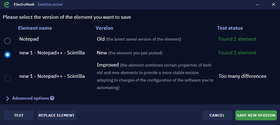
Here you can choose the new element version
Other parameters
Now that we reviewed the main parameter, there are not so many other parameters left.
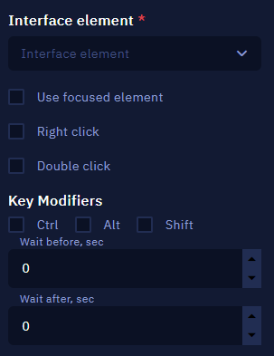
- Double click and Right click set the behavior when clicking the element.
- Key modifiers allow you to use combinations, such as Ctrl + click.
- Wait before, sec and Wait after, sec parameters indicate how much time will pass before or after executing this activity.
Click on coordinate
Description
This activity is used to simulate a click on the specified coordinates of the screen. The starting point is the top left corner of the screen, (0,0) coordinates.
Usually clicking on coordinates is used when more traditional and stable methods do not work. Setting coordinates 'as is' (or 'absolute' coordinates) is not a stable method as well because even the slightest change of the position of the target element can lead to clicking on a wrong element.
It is a good practice to use the so-called 'relative' coordinates. It means that you can find an "anchor" - an element that is pickable through Desktop Picker - then get its position using the 'Get position' activity, then and then use those coordinates to dynamically calculate the distance to the target element.
The idea is that the distance between this stable element and the target element is changed quite rarely. For example, the distance between the main Notepad window and the 'File' button inside will hardly ever change.
Parameters
There are two main parameters: x and y. They define the position of the element you are going to click. You can either set them manually or pinpoint the position by clicking the 'Set the coordinates' button. In this case you will be able to place the cursor at the desired spot of the screen and select it by holding the Ctrl key and left clicking it.
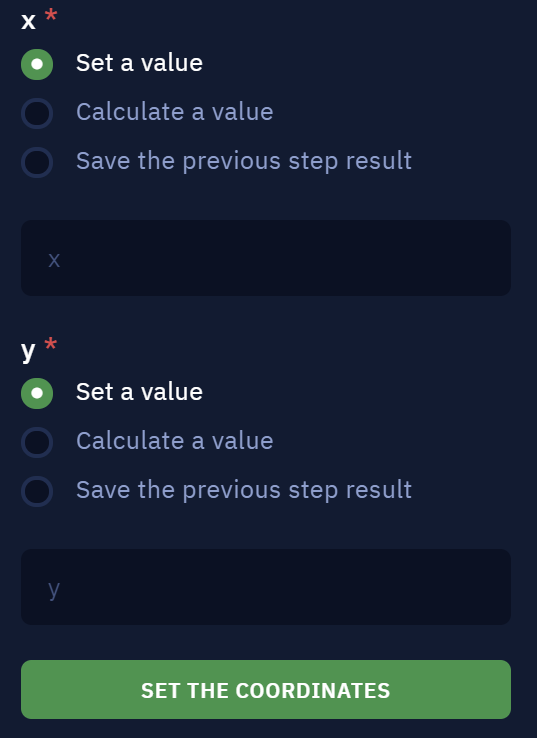
The parameters that define the spot coordinates
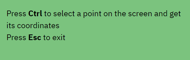
This message will appear in the top right corner of the screen when clicking the 'Set the coordinates' button
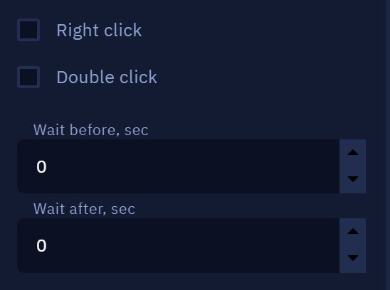
These are the other parameters: Right click, Double click, Wait before, sec and Wait after, sec. They define the behavior when clicking the point and the amount of time that will pass before or after clicking it respectively.
Other parameters
Read checkbox state
Description
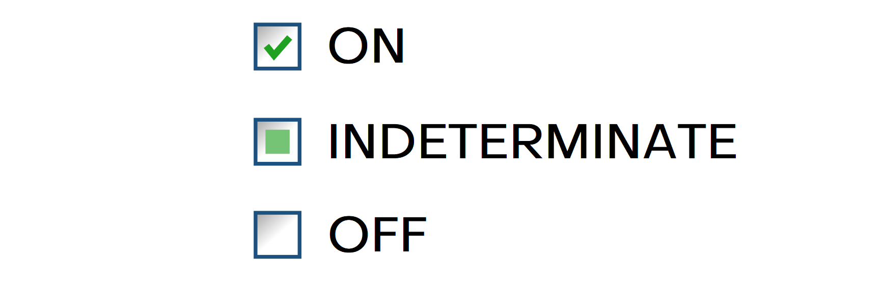
Get the value of checkbox state: 'ON', 'OFF' or 'INDETERMINATE'.
Parameters
Interface element
Select an element from a list or create new one.
Comment
Contains an annotation to the activity. The input text will be displayed above the activity name.
Examples of possible checkbox states:
Set checkbox state
Description
Set the checkbox state.
Parameters
Interface element
Select an element from a list or create new one.
Toggle
Allows you to change the state of the checkbox from the current one to the next in order.

Check
Allows you to set the state to 'ON'.

Uncheck
Allows you to set the state to 'OFF'.

Comment
Contains an annotation to the activity. The input text will be displayed above the activity name.
Select list item
Description
This activity allows you to select a specific item in a dropdown list. The item to be selected can be chosen directly or determined as a variable, implying that the item itself can be dynamic.
Parameters
Interface element
Select an element from a list or create a new one.
List Item
- Set a value allows you to manually specify the item to be selected.
- Calculate a value allows you to use a special formula or a special method to determine the item to be selected. It can be used to specify variables in this parameter.
- Save the previous step result takes the result of the previous workflow action as the item to be selected.
Usage Examples
This activity allows interacting with dropdown lists easier.
Updated about 1 year ago