
Keyboard
Studio Pro activities > GUI Automation > Keyboard. Includes "Input to desktop app" and "Send hotkey".
Activities
| Input to desktop app | Send hotkey |
|---|---|
| Type a text into a desktop app | Simulate pressing a hotkey or a key combination |
Input to desktop app
Description
This activity is used to input some text in desktop applications. For example, it can input text into a text editor such as Notepad. We will use it as an example in this article.
Desktop Picker
To be able to click an element of an app, we must start from defining the app element to use. This is handled by Desktop Picker.
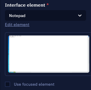
To pick the desired element, open the dropdown menu in the Interface element parameter and then click the ‘Pick New Element’ button.
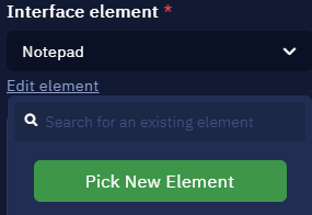
Here you can select an element or pick a new one
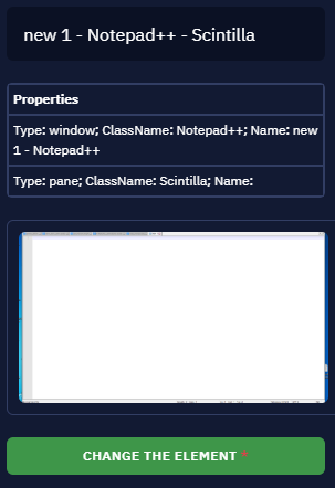
This will launch Desktop Picker. Open the desired app, hover your cursor over the required element (for example, text input field in Notepad). It will be highlighted red. Then press Ctrl + X to pick this element.
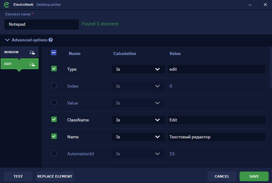
As soon as the element is picked, this window will appear. It indicates that the element was found and recognized. You can also set the element name here. It will be displayed in Studio Pro.
Advanced options menu displays the structure, or the selector of the indicated element. It usually consists of multiple tabs and each tab has its own attributes and values which represent the hierarchy of how the interface element is developed. You can modif, check or uncheck the attributes to achieve better accuracy or stability of interaction with the element.
The ‘Test’ button lets you check if the element was defined correctly. Upon clicking it, focus will be shifted to the browser window and the picked element will be highlighted yellow if it was recognized correctly. It can display one of the following messages:
- Found 1 element means that the specific element was successfully recognized.
- Found >1 element means that there are a few similar elements. In this case it is required to pick one of them or double check the advanced options.
- Not found means that the element was not recognized and must be redefined or the advanced options must be corrected.
The ‘Replace element’ button lets you pick another element.
Click ‘Save’ once you are ready. This element will be saved for further usage in Studio Pro activities.
Once the setup is done, you should see this in the Interface elementparameter. There is a preview image of the picked element.

Preview of the selected element
Alternatively, the Use focused element checkbox lets you use the element in your currently opened app. For example, you have opened one more Notepad file and you are currently editing it (this means that your cursor is placed somewhere in its text input field). In this case you may skip choosing the specific element as described above. Your text will be typed into the focused app.
It is also possible to edit an existing element that you have previously picked. To do this, click the ‘Edit element’ button below its name.
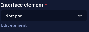
Here you can edit the element or pick a new one
This is what you will see. Here you can change its name or replace the element completely by picking a new one.

Element properties and the button that lets you replace it
Element properties and the button that lets you replace it
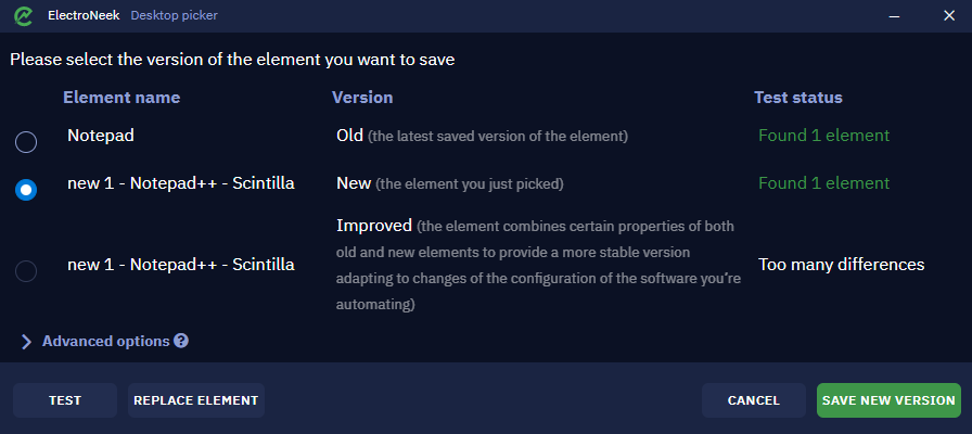
If you choose to replace the element by clicking the ‘Change the element button’, Picker will be activated again. Once you pick the new element, this window will appear. It shows the old and new versions and lets you either save it and overwrite the old element or cancel the replacement.

Here you can choose the new element version
An important note about elements names: when working with text editors such as Notepad or others, the file name is usually changed after the file was modified. Often an asterisk symbol (_) is added to its name. For example, if the file name is new1.txt, then after modifying it will become _new1.txt. Pay attention to this and make sure to choose the proper attributes.
Other parameters
Now let us review the remaining parameters.
Main activity parameters
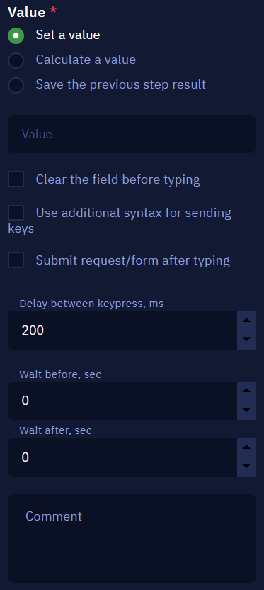
Value parameter defines the text that will be input to the chosen element. This is a required parameter. It has the following options:
- Set a value option lets you input the input text manually as a string.
- Calculate a value enables you to use available JS properties and methods to form the input text.
- Save the previous step result picks the previous activity result and defines it as the input text here.
Clear the field before typing erases any symbols found in the input text field before inputting your text.
Exceptions when entering service characters
When entering % , ^ , ( , ), { , } or + characters, you must use curly brackets. For example, {%} , {^} , {(}.
The Use additional syntax for sending keys checkbox enables you to use the reserved characters such as {, % and others to send specific keys like {ENTER} and more. If disabled, any symbol in the Value string will be treated as plain text.
There is also the ‘Input from keyboard’ button that lets you input a key or a key combination. In this example we used Ctrl + G combination.
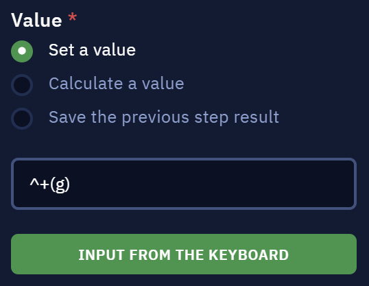
Here you can use a key or key combination
As of 5.4 version it is also possible to use the Submit request/form after typing option. If enabled, the bot will automatically press a specific key or key combination to send a form after filling an input field. This can be set by opening the dropdown list (Submit by pressing). It contains the following options: Enter - default value, Ctrl + Enter, Alt + Enter. This can be used for a lot of different applications UI features.
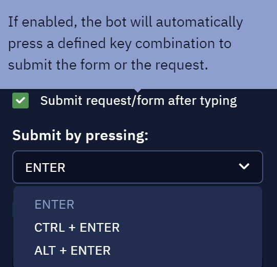
Submit request/form after typing option
Delay between keypress, ms lets you set the amount of time between input of each character from the input text. For example, it can be used to simulate a user typing the keyboard.
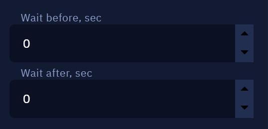
Wait before, sec and Wait after, sec parameters indicate how much time will pass before or after executing this activity.
Send hotkey
Description
This activity is used when it is needed to simulate pressing a specific hotkey or a key combination. It can be useful when interacting with all of kinds of applications.
For example, it is possible to input some text into a file and then save it. This is how this feature makes interaction with applications much simpler. Otherwise, you would have to pick the 'Save' button in the application manually using Desktop Picker which is more time consuming.
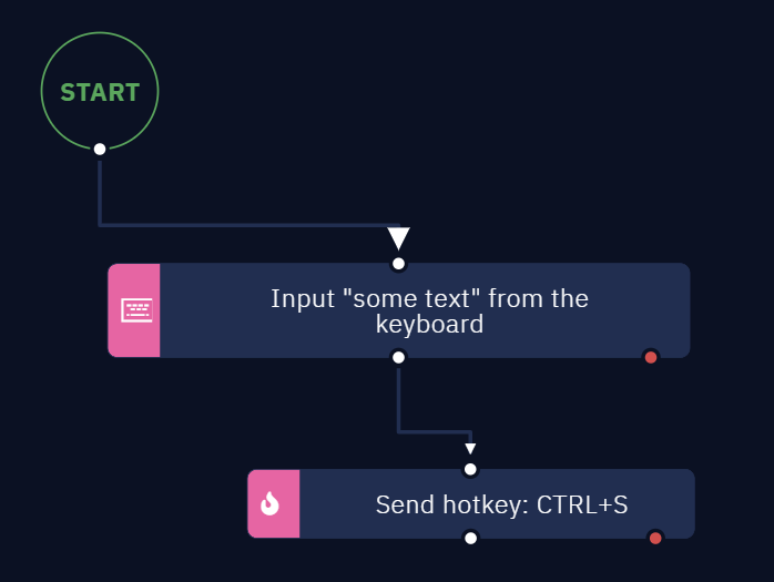
In this example workflow we input text into a .txt file and then save it right after text input was complete
Desktop Picker
To be able to click an element of an app, we must start from defining the app element to use. This is handled by Desktop Picker.
In this example we pick the input field of Notepad++ application which was used in the example above.
To pick the desired element, open the dropdown menu in the Interface elementparameter and then click the ‘Pick New Element’ button.

Here you can select an element or pick a new one
This will launch Desktop Picker. Open the desired app, hover your cursor over the required element (for example, text input field in Notepad). It will be highlighted red. Then press Ctrl + X to pick this element.
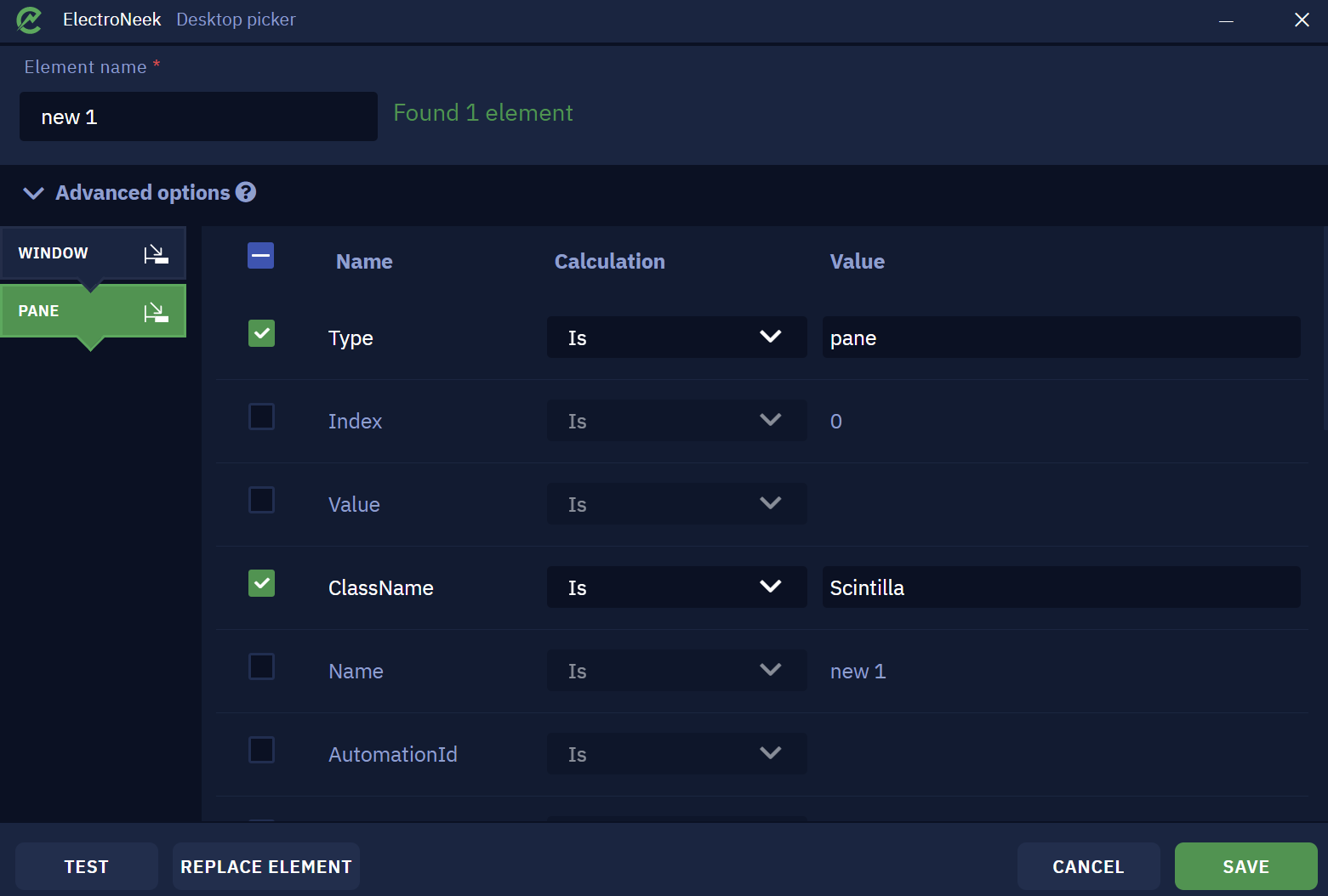
As soon as the element is picked, this window will appear. It indicates that the element was found and recognized. You can also set the element name here. It will be displayed in Studio Pro.
Advanced options menu displays the structure, or the selector of the indicated element. It usually consists of multiple tabs and each tab has its own attributes and values which represent the hierarchy of how the interface element is developed. You can modify, check or uncheck the attributes to achieve better accuracy or stability of interaction with the element.
The ‘Test’ button lets you check if the element was defined correctly. Upon clicking it, focus will be shifted to the browser window and the picked element will be highlighted yellow if it was recognized correctly. It can display one of the following messages:
- Found 1 element means that the specific element was successfully recognized.
- Found >1 element means that there are a few similar elements. In this case it is required to pick one of them or double check the advanced options.
- Not found means that the element was not recognized and must be redefined or the advanced options must be corrected.
The ‘Replace element’ button lets you pick another element.
Click ‘Save’ once you are ready. This element will be saved for further usage in Studio Pro activities.
Once the setup is done, you should see this in the Interface elementparameter. There is a preview image of the picked element.
Preview of the selected element
Alternatively, the Use focused element checkbox lets you use the element in your currently opened app. For example, you have opened one more Notepad file and you are currently editing it (this means that your cursor is placed somewhere in its text input field). In this case you may skip choosing the specific element as described above. Your text will be typed into the focused app.
It is also possible to edit an existing element that you have previously picked. To do this, click the ‘Edit element’ button below its name.

Here you can edit the element or pick a new one
This is what you will see. Here you can change its name or replace the element completely by picking a new one.
Element properties and the button that lets you replace it
If you choose to replace the element by clicking the ‘Change the element button’, Picker will be activated again. Once you pick the new element, this window will appear. It shows the old and new versions and lets you either save it and overwrite the old element or cancel the replacement.
Here you can choose the new element version
An important note about elements names: when working with text editors such as Notepad or others, the file name is usually changed after the file was modified. Often an asterisk symbol (_) is added to its name. For example, if the file name is new1.txt, then after modifying it will become _new1.txt. Basically, it means that one of the selector attributes was changed, and the element will not be recognized even it is still the same input field. To prevent trouble caused by it, it is advised to uncheck the Name attribute or pick the element once again as shown above and select the Improved option. In most cases this will combine the properties of the old and the new element and make the selector work correctly.
Parameters
The first parameter of this activity is Interface element. It defines the element that will be used here. The process of picking an element was described in the previous section.
Next, there are Use focused element and Click on element firstcheckboxes. The former was also described in Desktop Picker section above. The latter is self-explanatory.

Use focused element and Click on element first checkboxes
Then there is the core part of the activity: Key Modifiers and Key parameters. It defines what key or key combination will be used.
Key Modifiers parameter is used to simulate holding a specific key. Ctrl, Alt, Shift and Win keys are available. Check as many as required.
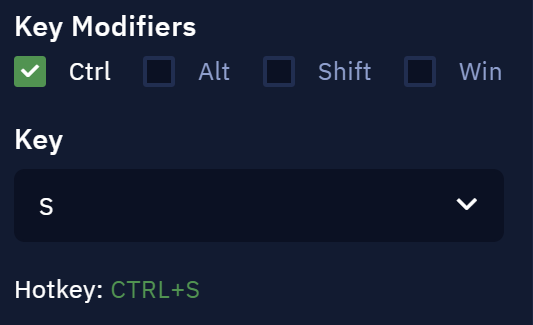
Here we use Ctrl + S key combination to save the file
Also note that the only English letters must be used as hotkeys. The system keyboard layout must also be switched to English while the bot is being executed.
Wait before, sec and Wait after, sec parameters indicate how much time will pass before or after executing this activity.
Wait before, sec and Wait after, sec parameters
Updated about 1 year ago